Direction 01 · brand board for review
Tidy. A clay world for trades.
A small, tactile toy world in matte clay and grain, with crisp, plain words on top. It's friendly enough to be memorable and calm enough to trust with your business.
Name
Tidy is what a tradesperson says about good work: “that's a tidy job”. It's also what we do to a business's online presence. Short, warm, British, and it describes the result rather than the technology. It's a working name, not checked for trademark or domain availability.
Everything in order. Nautical, a bit longer, very British.
“Spruce it up.” Light, fresh, suggests improvement over replacement.
Calm and adverbial. It reads well in sentences: “Neatly done.”
Wordmark
Bricolage Grotesque 800, tracked tight, with the tittle of the i replaced by a clay ball, the one object that appears in every scene. It's set in live type, so it stays crisp at any size; the ball is the only drawn element.
App icon and favicon: the T plus the ball. Keep clear space equal to the ball's diameter on all sides. On orange, the ball turns butter yellow.
Colour
The page stays white, and colour lives in the clay world and in tokens. Clay orange is the one action colour. Pastels are studio backdrops, each matched to an object. Grey “unfired” clay means planned, not ready.
Type
One family, Bricolage Grotesque, using its optical-size axis: chunky and characterful at display sizes, calmer at reading sizes. Display is set at weight 800 with −0.045em tracking. Body text is weight 400 at 17px, 1.55 line height.
Display 96Good at your trade.H2 64What we take care of.H3 25Reviews start to arriveBody 17A proper website, a well-kept Google Business Profile and an easy way to ask for reviews.Small 15No payment or commitment.Components
Everything is a soft clay token: generous radii, a soft offset shadow, an inner highlight and a hint of grain. Buttons squish when pressed. Dashed outlines mean “not part of the £50” or “not ready yet”.
Buttons
Input
Labels
Token (story card)
Planned item
Imagery
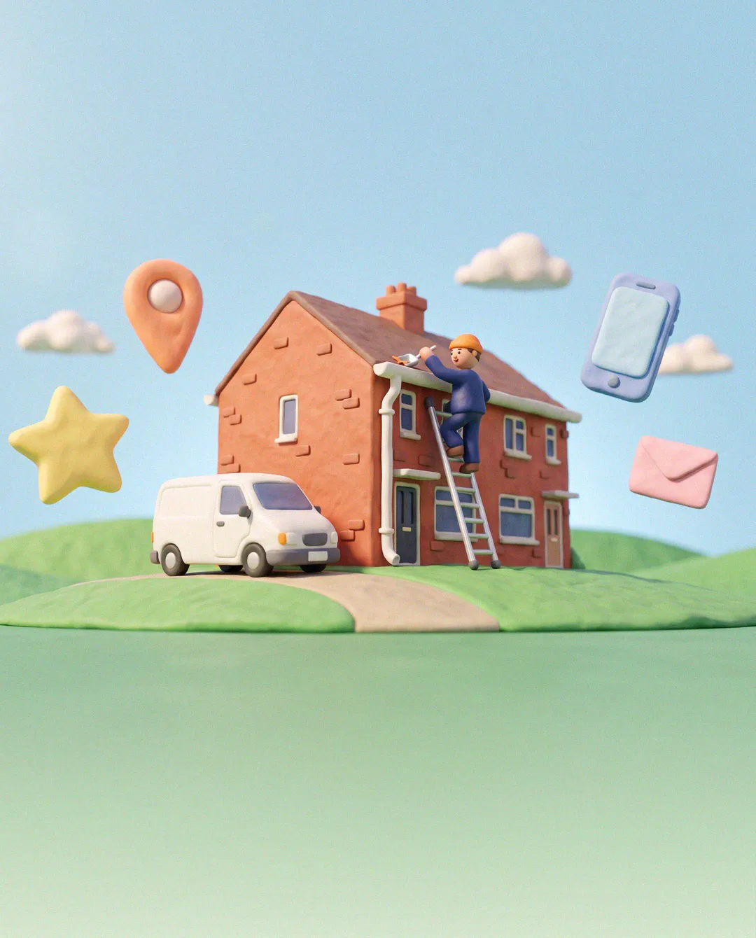
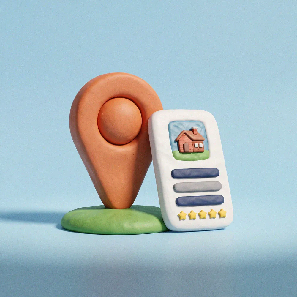
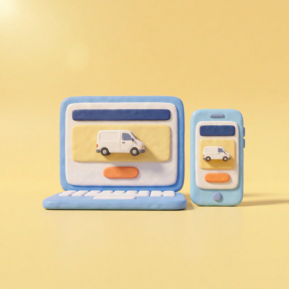
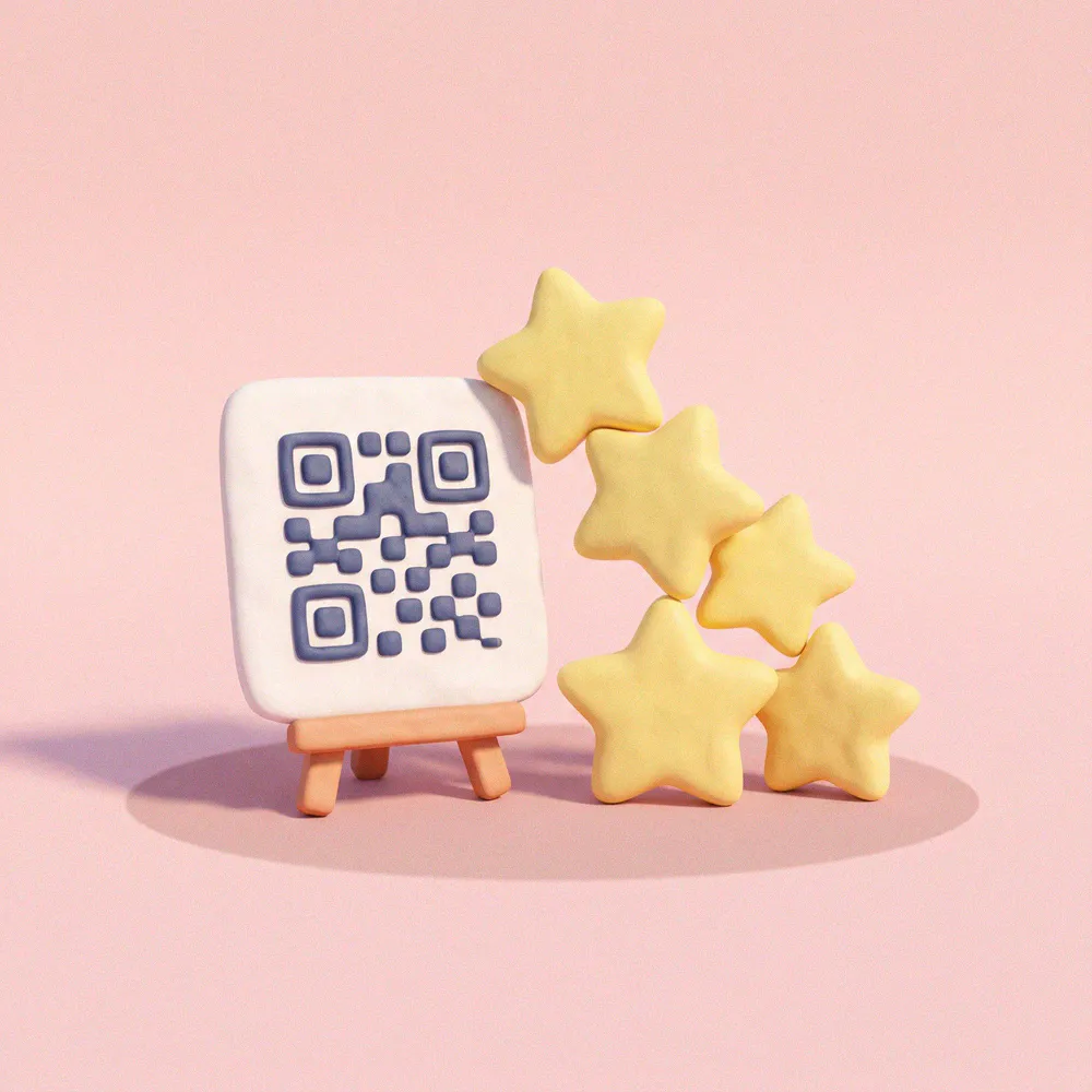
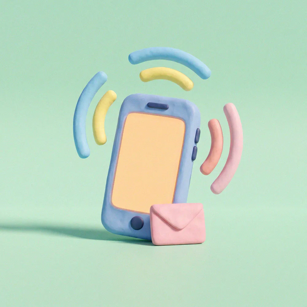
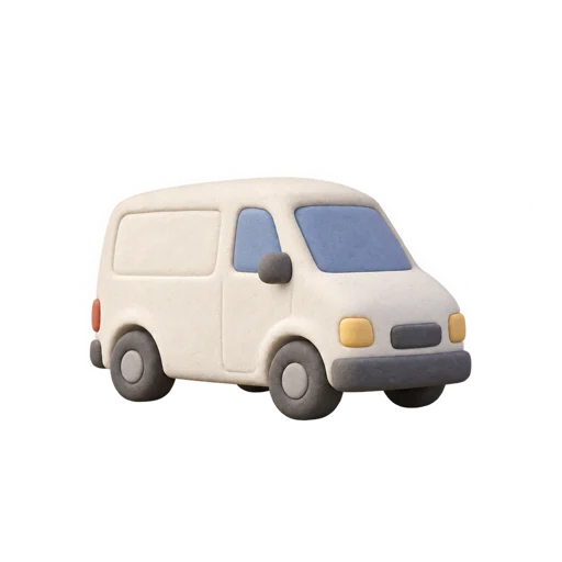
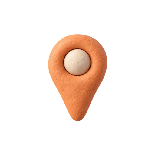
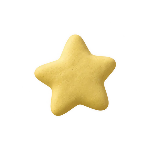
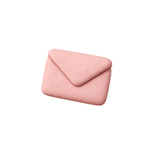
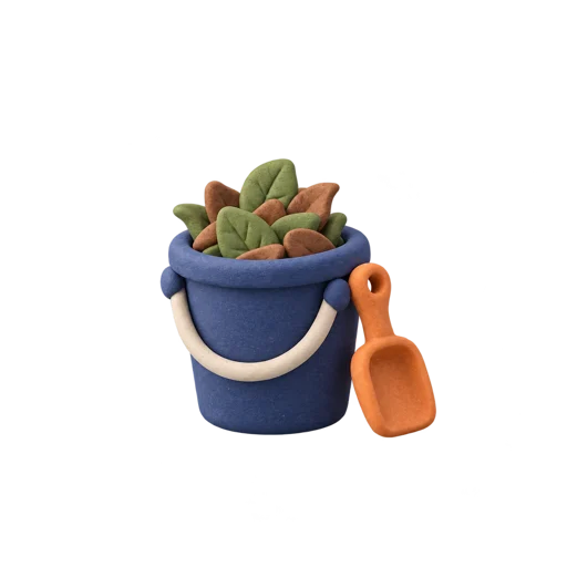
Original clay dioramas generated with Nano Banana Pro, all referencing the same hero still so the world stays consistent. Props are GPT Image cut-outs with real alpha, and loops come from Kling v3 with the first frame equal to the last. Grain is layered in the browser, which keeps the video small.
Motion
The video is the ambience and the HTML is the story. Each moves in its own way, and neither competes with the copy.
Squish, don't slide
Tokens arrive with a slight overshoot (cubic-bezier .34, 1.56, .64, 1), the way clay settles. Exits are quick ease-outs.
Closed loops only
Every video loop starts and ends on the same still, about 5 seconds, camera locked. Nothing new appears and nothing leaves.
Grain is alive
An SVG noise layer shifts in four steps every 0.9s over clay surfaces, and a speckled mask dissolves scenes into white. Both are CSS, so they're cheap and sharp at any size.
Calm by default
Phones get still images. Reduced-motion users get posters, instant story states and no autoplay. Every loop has a pause, and loops off screen stop.
Voice
Plain, warm, a bit wry. We talk like the person who turns up on time and tidies up after themselves. We never promise rankings or results; we promise the work.
Good at your trade. Easier to find.
A tidy job, online too.
Your work speaks for itself. We'll help people hear it.